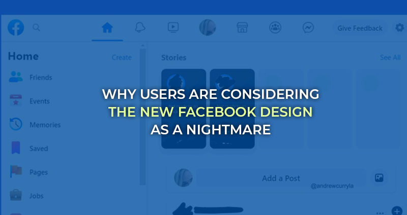
Facebook has rolled out another ‘supposed-to-be’ mind-blowing update to capture the attention of worldwide users. However, things didn’t turn out the way they planned, and people actually end up hating it. Yes! You heard it correct; people are so disappointed that they are threatening to quit Facebook.
Now, the experts think that this widespread hate can further taint the reputation of Facebook.
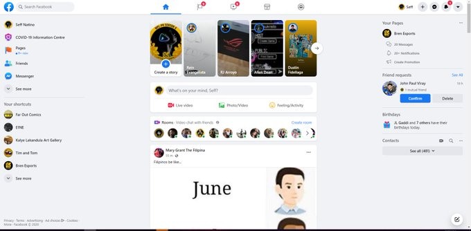
The new interface is the cause behind the hate
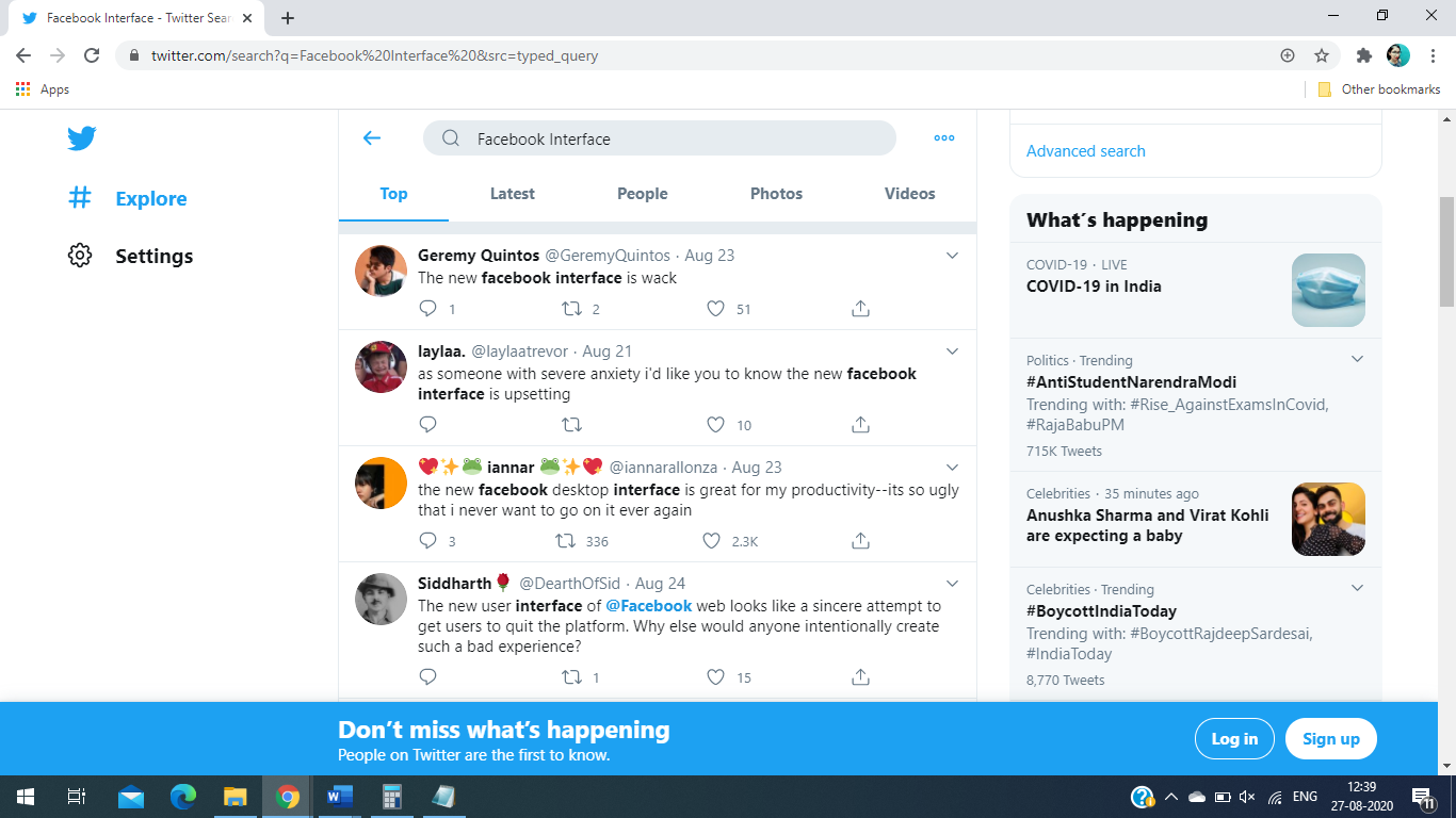
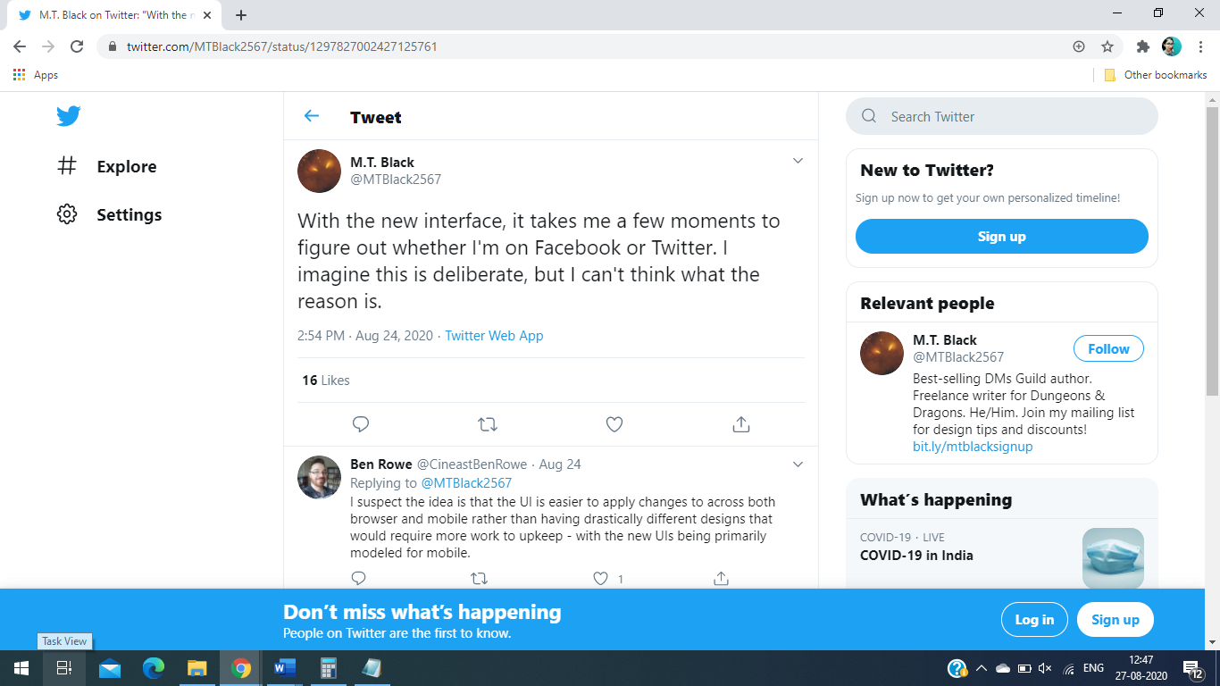
If you search ‘Facebook Interface’ on twitter, then everything that surface shouts Negative. Not just negative, each of these tweets represents hate for Facebook. Take a look by yourself;
Why do users hate the new user interface?
One of the main reasons why people hate the new Facebook interface so much is because it is confusing.
The first sign of an ideal user interference is how simple it is to find and do things on the web page and what Facebook has done is right opposite to it. So, do you think anyone will want to add Facebook in their Social media marketing services?
Users shouldn’t have to go through the manual to publish a simple post on Facebook. This new interface will indeed become a lesson for Facebook.
New navigation icons are confusing
Navigation icons should directly take you where you want to go when you click on the icon, but the new navigation icons are quite frustrating. It is no longer clear what will happen if you click on the ‘messenger’ icon, bell icon or any other Facebook icon.
The Facebook messenger icon has a sideways “Z” and a little tail that makes it look like a thunderbolt, but on the desktop, it is so small that no one can recognize it instantly. Instead, they might need to spend some time looking for it before figuring out where it is.
And it is just a minor thing that is causing frustration among Facebook users. It is the host of the new Facebook redesign quirks that creates the perception that it requires manual to post anything.
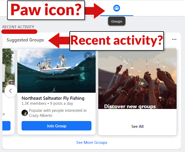
Facebook group icon
After the Messenger icon, let’s talk about the group icon on Facebook. When there is a group activity, the paw look-like icon will show numbers, which is completely fine- but clicking on the icon takes you on the different page that suggests you a bunch of groups you can join.
It is completely different from what users want to see when they click on the group activity icon to see the activity.
Being able to understand and predict what icons help users to do things they want. However, Facebook failing to accomplish this simple task is what causes frustration.
The redesign is so bad that people are threatening to quit
Facebook had months to come up with a new user interface.
Although the overall look is more pleasant to look at, as many have commented the Facebook engineers just copy-pasted Twitter’s design.
The previous beta version also has too many bugs to continue using it, and this supposedly has fixed some of these issues, but it was the complete opposite.
When it comes to designing new user interfaces, people have high expectations from brands like Facebook, and when they fail to meet those expectations and do completely opposite, it ruins their long-established reputation in the market.