What was the last time when you searched for something online? Not a while ago, right? So, here comes the main question, what are you using to make the daily or weekly basis searches? Desktop or mobile device? If you are just like the rest of the 80% of the internet users, then you are probably searching on the smartphone or tab from the comfort of your home- right?
In fact, according to the survey in 2018, 80% of people on average spend around 5 to 6 hours a day and we are not talking about all the videos people search on YouTube. So, whether you have already accepted the mobile-led change or looking for more justifications before investing in web development services to import your website to responsive design, this post will answer all your queries at once. With this post, you will also explain why both traditional and modern website should adapt the mobile-friendly design in 2019.
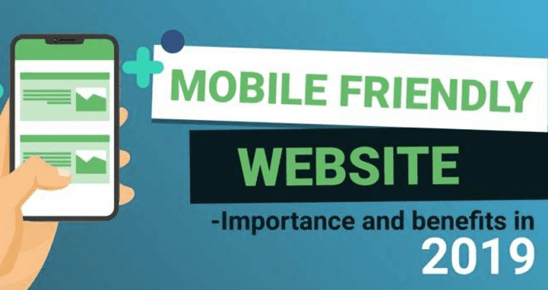
The Main Difference Between a Mobile Friendly and Responsive Website
Now, right before we move further with our journey, it is important to clarify the basic difference between the mobile-friendly and responsive website. Often people use these terms interchangeably but the truth is both terms are not entirely similar. The main difference between these two terms lies into the down to the layout of information.
The mobile-friendly website is designed to shrink out the layout of the website to fit the size of the mobile devices. This adjustment in the layout often lead to the poor user experience and result in the bothersome task of zooming in and out to read every information available on the website. On the other way around, responsive websites are designed to automatically restructure the website according to the size of the device it is running upon. In short, you can say that all the responsive websites are mobile-friendly but not all the mobile-friendly websites are responsive websites.
Reasons to Have a Mobile-Friendly Website for Your Business
To make sure, your message is rendered properly to your target based audience despite devices they are using to access your website, it is best to go with the responsive website. Here are the deeper reasons why?
Search engine actually care about the design of your site: If you are living and running your website in the under the shadow of search engines, then you must be well-aware of the strong algorithm updates that can turn your whole world upside down. Back in 2015, when Google rolled out the algorithm to priorities the mobile-friendly websites over desktop websites, many high ranking websites fell down with a loud thud overnight!
At the end of the day, the point is Google believe that Mobile websites are the future of digital marketing and plus, they want to deliver the best experience possible to its users. In the upcoming time, Google is also thinking about changing its current indexing model to “mobile-indexing” to give more significant to mobile-friendly websites.
Beat the competitors in the race: When it comes to market, there is always a never-ending war between brands, each of them fighting for the attention of the online visitors. Nowadays, brands are going beyond their limits to deliver a great user experience to their visitors. So, how are you going to compete with others when you can’t deliver a better user experience to your website visitors? By investing in website development services, you are not securing your customers but also winning over the customers of your competitors.
Related Post: What Makes Python The First Choice For Developing A Business Website?
A responsive website is “future-proof”: With each passing day, the internet is becoming more accessible around the globe. Now, with more than 1.2 billion people making searches through their mobile devices the future of your mobile-website is bright. As the internet goes with the crowd rather than going with the tech, shifting your website on mobile-friendly design.
In the end, the mobile website is just an aspect of having a successful website. To make your website mobile-friendly, you can always consult with the ProICT LLC- the top Website Development Company in the USA.